


From whale oil to biofuels, with a ribbon
We are currently rolling out a complete visual branding system for Sprague, a 142-year-old energy company based in Portsmouth, New Hampshire. The impetus for the rebranding was operational: Sprague is separating into two companies for regulatory reasons, offering similar products and services aimed at separate markets. With an array of products (including diesel, jet fuels, natural gas and biofuels, as well as material handling services at 15 ports), potential for customer confusion about the new entities drove the strong need to develop a comprehensive brand. The challenge was to create a visual system that would unite the separate companies while clarifying the overlapping offerings of each.
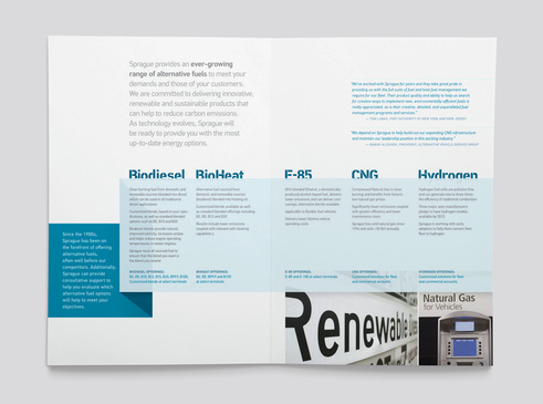
In learning about Sprague's history - founded in the nineteenth century with whale oil and coal - what struck us about their longevity was their ability to constantly evolve: innovating through multiple eras of the ever-changing energy industry with a relentless ability to anticipate customers' needs. We encapsulated this balance of innovation and stability with the brand line 'One step ahead. For 140 years.' which became the inspiration for the key graphic device: the Sprague ribbon. Weaving in and out of the materials, it symbolizes the constant forward motion that has characterized the company's progress, while changing shape and format much the way that Sprague is always adapting to meet their customers' needs. From this, we created a codified system for all materials - defining distinct visual elements for each product division and operational entity, with built-in flexibility to ensure that the wide variety of materials they produce does not get monotonous in layout or message.
Click on each image for a larger view
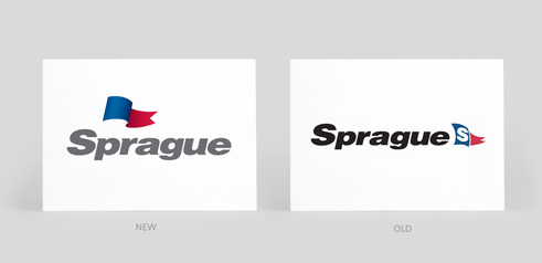
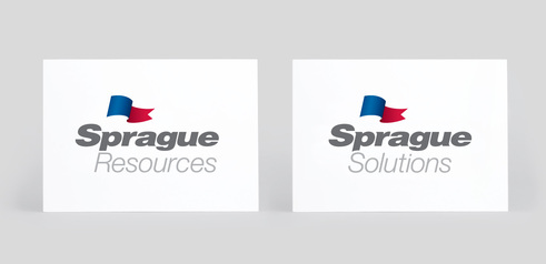
Based on the flag that flew on the ships of the original Sprague Steamship Company,we updated the logo with a more free-flowing design while retaining visual brand equity. The two new operational entities - Sprague Resources and Sprague Solutions - received logos that visually tie to the main brand.
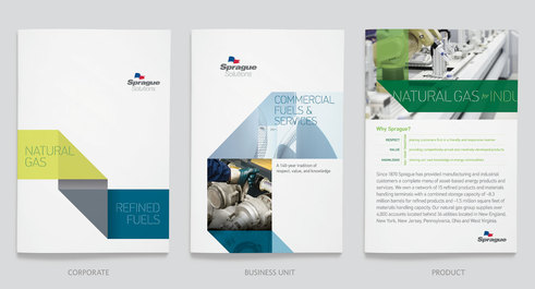
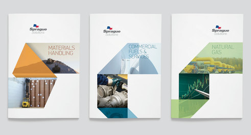
We organized the print marketing collateral into three levels - corporate overview, product division, and individual product materials - with specific layout templates and guidelines for each.
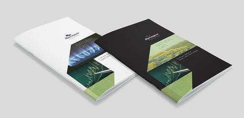
All layouts for Sprague Solutions and Sprague Resources use the same templates to provide a consistent brand, with one key exception - color. Materials for Sprague Solutions, which focuses on small businesses and municipalities, feature liberal amounts of white space. Materials for Sprague Resources, which is more concentrated on energy industry resellers and the ports, are distinguished by large areas of black. Additional content distinctions of messaging and photography ensure that materials for each company speak directly to the needs of their customers.
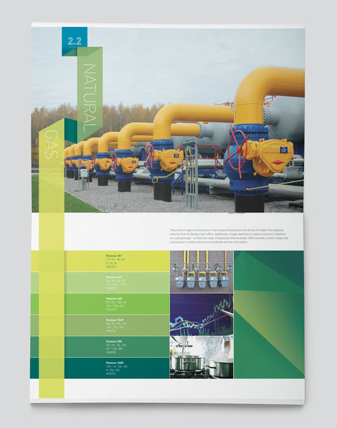
Regardless of the operational entity, the three product divisions are distinguished by unique color palettes to ensure that product materials, regardless of company, are visually related.
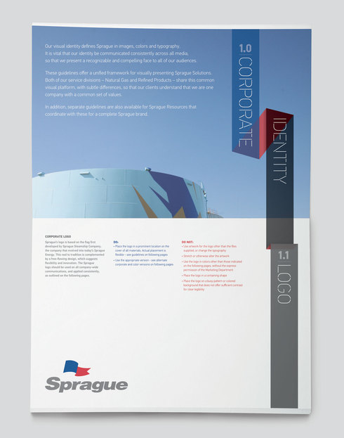
Separate guidelines documents for the two companies clearly define the elements that are common versus the ones that are specific to the businesses and individual product lines.