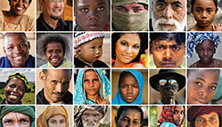
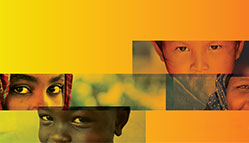
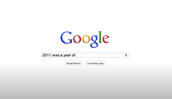
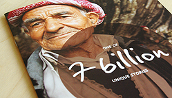
home

UltraVirgo Creative/Analysis

Recently about Design

Since designing "green" is all the rage, we just launched our greenest web site yet for Legolas Media. It includes kelly, hunter, lime and mint. Not to mention our favorite: chartreuse.
We've been doing a lot of work lately gearing up for the New Aging Conference at UPenn in October (including the web site and this brochure). But I really love what the UPenn students did with these makeover videos: Aging 60 years in 60 seconds.
We just launched the initial materials for the New Aging Conference organized by the University of Pennsylvania and our good friend Matthias Hollwich of HWKN and Architizer fame. Assembling a world-class roster of provocative speakers from various industries, and culminating in a manifesto to reinvigorate the industry, it aspires to spark a new era of elder care. With that in mind, we developed a logo that imagines a "New & Improved!" aging experience and asked participants to imagine "How do you want to live when you are old?" through the brochure and web site. All with the goal of getting society to think beyond the current options; to imagine - and create - our own better future.
We just received a shipment from the printer with our 2010 Portfolio of projects for Health industry clients. With 44 pages packed with photos of some of our greatest work for clients in the healthcare, pharmaceutical and related industries, it's a great feeling to look back and see the breadth of projects we have produced over the last few years. With clients ranging from BlueCross BlueShield to an innovative nursing home in Los Angeles, we have learned a lot of interesting insights, love working on health projects, and are really looking forward to what 2010 has in store. If you are in a health industry and would like a copy of the book, drop us a line.
We've been busy at work on a number of projects for the elder care industry. One of the most interesting is the upcoming New Aging Conference in April, put together by our friends at UPenn. Examining Architecture and Aging, it will present exciting advances in the industry and hopes to develop a manifesto for the future of elder care. We just put up a holding page for the web site, and have some exciting materials in the works.
Our friends and clients at MXTelecom are out in San Diego at CTIA. If you're there, feel free to use our simple wayfinding ad in lieu of those complicated showfloor maps.
Just got back from vacation to some good news: three recent projects have won American Graphic Design Awards! The winners are: Our brochure for CoreNet Global Orlando Conference, our logo for KFT Capital, and our poster for Bruce Levingston's Sacred + Surreal concert.
We just launched the full web site for Virgil Skilled Nursing Center in Los Angeles. They are committed to rethinking elder care, and the site is just the beginning of translating that to the web. Ever seen a nursing home with a blog? Me either, but it will allow potential residents, family members, area doctors, discharge planners, and the healthcare industry to get a closer look at some of the cool, innovative things they are implementing. Starting with a user-centric, eco-friendly renovation. More to come as we continue break new ground in the world of nursing home web sites.
We just heard that Clean Combustion Technologies, an 800-page engineering textbook we produced for Alstom Power won a Bellringer award from the Publicity Club of New England. In case you missed it the first time, here are a few pics of the cover, hardcover, title page, chapter opener, a spread, and a diagram or two out of the hundreds that were created from scratch.
We are strong believers in the power of design to shape the ability to comprehend information. We have been known to get as excited about designing an infographic or clinical form as we have about a logo or brochure. Which is why I love the Op-Ed piece from Design for Democracy that appeared in the NY Times this weekend. It parallels the need for clear information on Credit Card disclosures with the design of Nutrition Facts on food packaging. These days, financial health is just as important as physical health, but the choices have gotten infinitely more complicated.
UVC client and piano virtuoso Bruce Levingston has a performance coming up entitled The Sacred + The Surreal. (Our poster here.) Just hearing him perform innovative new compositions would be enough. But screening a Salvador Dali home movie in St. Bart's church? Now, that's surreal.
I just returned from the Patois, the 2009 New Orleans Human Rights Film Festival. It was an incredible line up of Films - a few highlights were Nerakhoon (The Betrayal), Disturbing the Universe, and keep an eye out for the release of the House that Herman Built.
Watch the trailer I created for the fest here.
I bought Happy Baby green puffs. Noticed on the bottom of the container that it says Method, the cleaning company. So, I googled to discover that Method had thousands of containers it was never going to use after a packaging redesign. So Happy Baby bought them, to package their puffs in non-toxic, recyclable, non-Bisphenol A containers. Interesting packaging choice. I'm still not sure if it's brilliant or anxiety inducing. 
We've been working overtime on a complete branding package for the Virgil nursing home in Los Angeles. And the first web page is now public. It's just a holding page for the moment, but we're working furiously on the full public site. Keep on eye on this facility. They're just getting started with a visionary new management and an innovative team of affiliates, and are reshaping the elder care industry. If you're interested in getting notified when the full web site is live, just sign up on the holding page, or contact us and we'll keep you in the loop on progress throughout.
Just returned from the first of the lecture series at UPenn on Transforming the Nursing Home - with special guests David Pollak of ADL Data and Charles Fishman, author of "The Wal-Mart Effect." See our poster design for the series, and stay posted on the upcoming lectures.
We recently wrapped up our first 800-page book: a reference guide on combustion technologies. If you're looking for a good beach read for summer, this is not it. So, to save you the reading, here are some pics of the cover, hardcover, title page, chapter opener, a spread, and a diagram or two out of the hundreds that were drawn from scratch.
I just got back from reviewing midterm research projects at a seminar at UPenn about Transforming the Nursing Home. There is a large number of organizations and facilities that are rethinking elder care, such as the Green House and (taking an entirely different tack) Kildegaarden in Denmark. All (okay maybe not all) of which will be informing the New Nursing Home we are branding in LA. Stay tuned.
A lesson in brand equity: Freshening up a dated design is often a good idea. But if you have one of the most identifiable images in your industry (like Tropicana's straw-in-the-orange) don't dump it. Your consumers do care. p.s. To designers: After communicating what the product is, the most important challenge in packaging design is differentiation: stand out from the competition and clarify distinctions within the product line.
We just launched a new site and identity for the fine folks at Gotham Tennis Academy. Did you know that blue is the new green? It takes a little getting used to, but is quite striking.
We just got the final copies of this invitation that we did pro-bono for a SEAS fundraiser. If you're looking to do some good this holiday season, we recommend you consider helping them out - these high school kids are doing some amazing things to aid students in disadvantaged areas, particularly in the hurricane-ravaged Gulf Coast regions.
Our work for PolyamorousNYC has just been added to the permanent collection at The Kinsey Institute (yes, the one founded by Alfred Kinsey). Definitely one of our more interesting distinctions. Which we are quite proud of, actually.
We've been working on a lot of identity projects lately. And the number one resource we always turn to when developing a logo is LogoLounge. It's easy to get a sense of the competitive visual landscape for a particular industry and identify trends that should be utilized or avoided. In particular, I highly recommend their annual curated books that are organized by subject matter (which we've been featured in).
I've just returned freshly inspired from a visit to New Orleans, where the city is beginning to buzz with preparations for the Prospect 1 Biennial opening in 1 month. I was down there working on the open air project, sponsered by the Arts Council of New Orleans and opening concurrently. A friend's gallery/experiment was just written up in the style section of the NY times. KK Projects has taken over a block of hurricane destroyed houses and given a new life and a little magic to the area.
UVC clients The Sex Positive Journalism Awards and Polyamorous NYC both have big events this weekend. (We did the identity and web sites for both). We have some fun giveaways in the works for them, and if you're interested in attending, let us know - we'll hook you up.
By some odd confluence of events, we've been doing a lot of HTML email formats lately. Can someone out there please implement some sort of standards that all email clients can adhere to? (That includes you, Microsoft.) I know it's a lot to ask, but my schedule would appreciate it.
Following up on my last post musing about when people can understand warning and bathroom signs, here's a light hearted site about them, should you need a warning sign of your own. Alert the world to Godzilla, gas masks, or what looks to me like a flashing fairy wand. Or check out Speak Up for more about pictograms.
Check out the video preview of Marion Bataille's book ABC3D a gorgeous alphabet pop-up book with a swing soundtrack.
As Pamela mentioned previously, we've been fascinated with music visualization lately. I came across this mesmerizing video of Bach. (Though I keep wanting a paddle and ball to appear.) Of course, the ultimate physical description of music was the grooves in LPs - I remember being fascinated by the guy that could identify records simply by looking at the vinyl grooves.
I want to thank the wonderful guys over at FontShop. Working on a book publishing project, I was trying to find the perfect text face. I decided to let their researchers make some suggestions, and gave them a set of parameters that I thought was near impossible to completely achieve - not just a complete feature set for mathematical and Greek characters, but also the right tone. Sure enough, they came through with a couple options that were spot on!
This site turns text you submit into "word clouds."
You can adjust fonts, color schemes, and a variety of other parameters. Perhaps a functional capability will come to me, but in the meantime it's a pretty good toy.